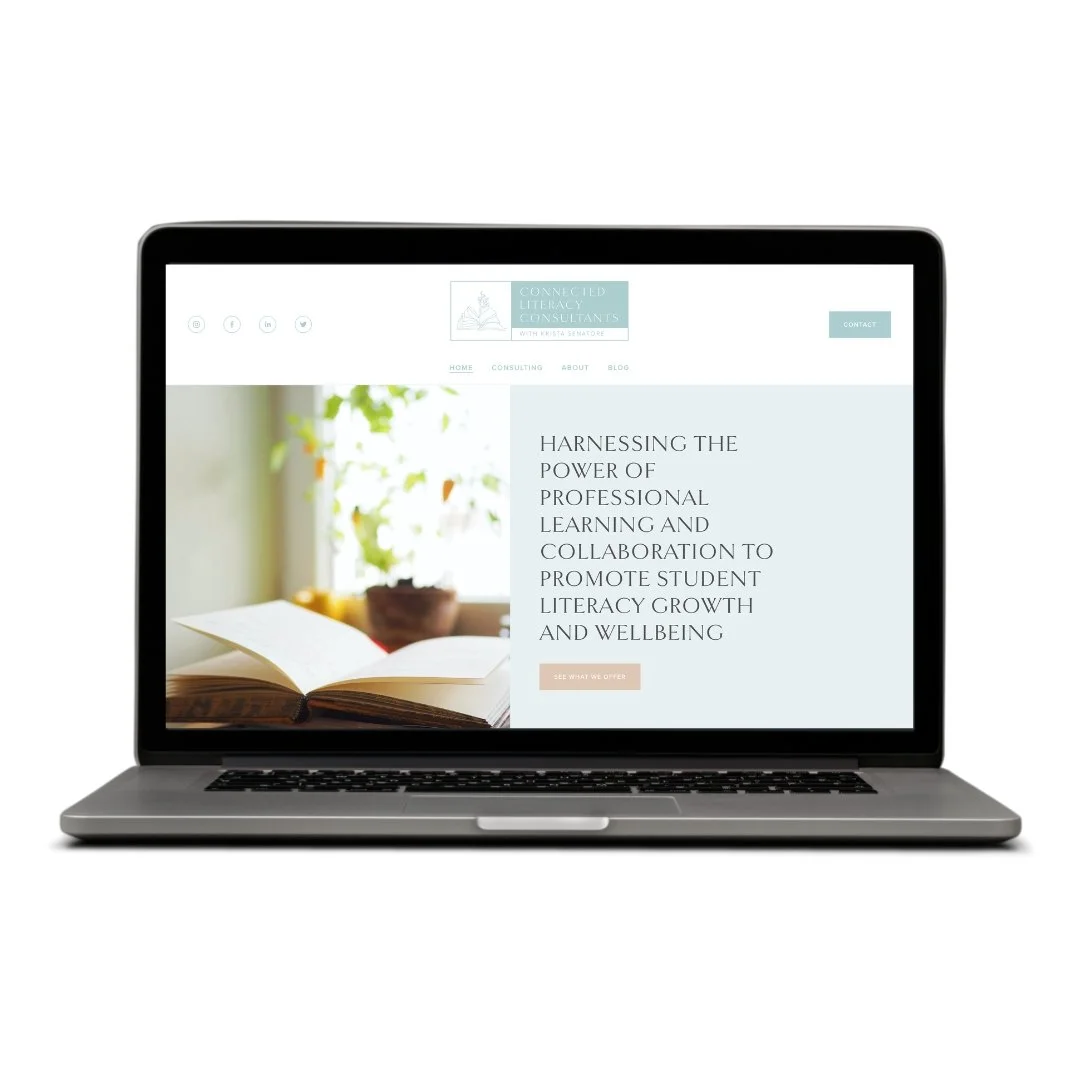
Client: Connected Literacy Consultant
Project: Logo and Website Design
Client: Jael Polnac / Yoga with Jael
Project: Logo and Website Design
Client: Ageless Healing Arts
Project: Logo and Website Design
Client: Waldorf School of Saratoga Springs
Project: Logo Rebrand
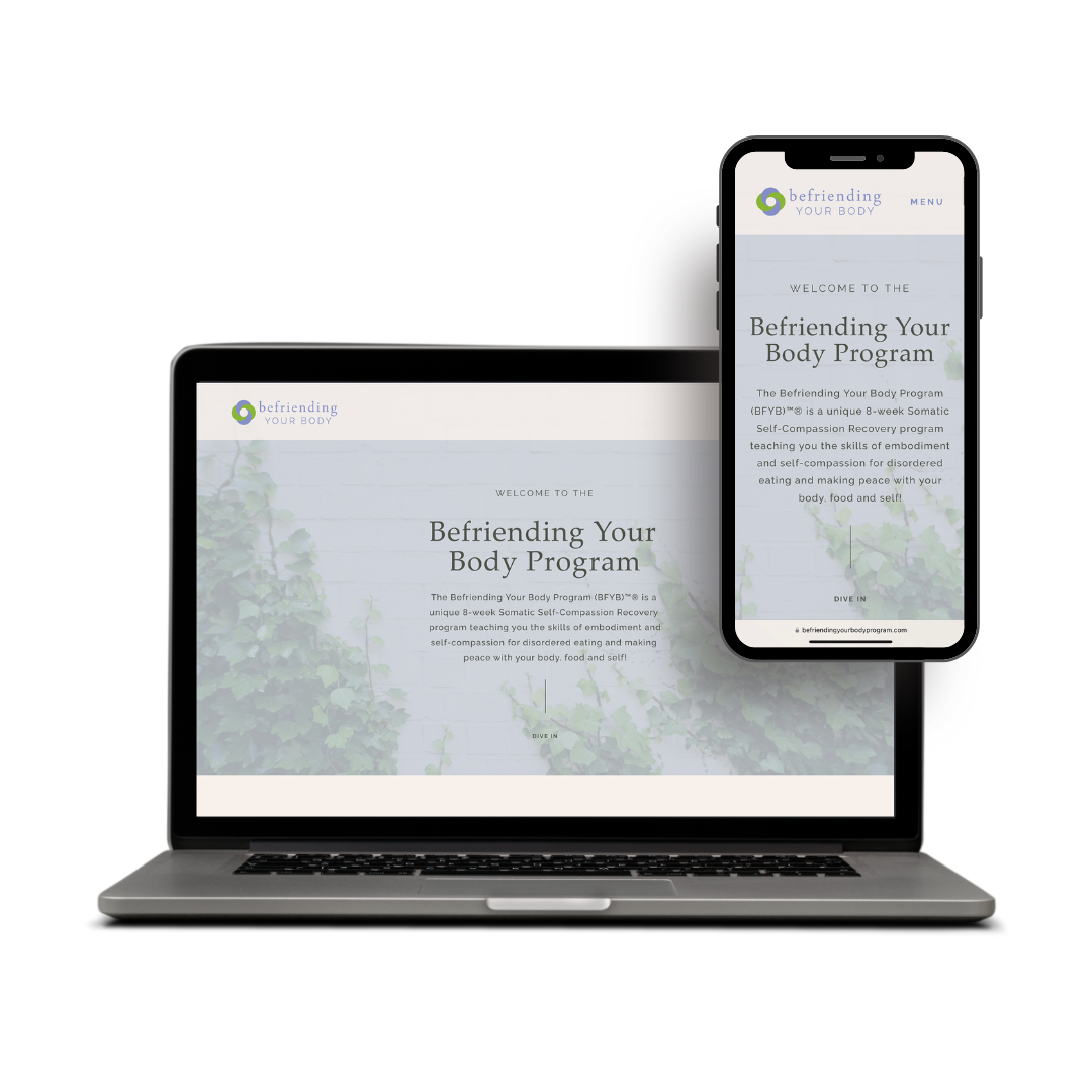
Client: Dr. Ann Saffi Biasetti (Befriending Your Body Program)
Project: Website Design
Client: Melissa Golub
Project: Logo and Website Design
Psychotherapist, yogi, and BFYB certified professional, Melissa Golub is one of those truly authentic individuals who walks the talk, with mindfulness and compassion at the forefront of each of her offerings. She practices from the perspective that everyone has the capacity to find peace, empowerment, and freedom within.
With a growing private practice for individual psychotherapy services and Befriending Your Body (BFYB)™® programs, she found herself in need of a warm, inviting website capable of taking online registrations. This site is geared toward adults who want resources and support in connecting with their intuition; who want to feel empowered in their decisions, and tap into what they really want, desire, love, and need.
In order to connect with their potential feelings of anxiety and/or depression, and desire to feel free, I wanted to emulate a sense of warmth, grounding, and compassion in the site’s overall aesthetic. This was accomplished through soft, earthy colors and textures; clean, spacious fonts; and comforting imagery. The copy is written to convey a sense of understanding; and the CTAs focus on inspiring empowered action.
Client: Katie Veltum
Project: Logo/Branding (and Web Design)
When we originally discussed ideas for bodyworker, artist and writer, Katie Veltum’s logo, she mentioned wanting to incorporate an elephant, as this held special meaning for her. It also denotes a sense of warmth, trust, and compassion—which are indicative of Katie’s offerings. Katie is uber compassionate and sensitive to the feelings of others; her goal as a bodyworker is to create a safe space for people to reconnect with themselves, become more embodied, and open to receive the gifts of compassionate touch. Her sessions go deep, meeting people where they’re at, and Katie genuinely holds space for each client.
I wanted the logo to represent this depth of what it is to experience embodiment after feeling disconnected; and I wanted it to capture her creativity as an artist and writer — for these are significant outlets for her authentic self-expression. You’ll notice that I translated these qualities in different ways, such as the subtle flower offered up in the elephant's trunk; the soft, fine lines of the elephant itself; the imperfect, whimsical font; and the rich, saturated color palette.
You can also see how her branding was used in the Website Design I created for her here.
Client: Mudita Being
Project: Logo Design, Branding, and Website Design
Lisa Davidson of Mudita Being initially came to me looking for help with a website. However, as a start-up in need of some branding, we began with a simple logo design. Then we wove the elements of her brand into social media graphics, and eventually the website itself!
The branding elements represent the depth of the ancient art of healing that Mudita Being is rooted in, while the minimalism of the design itself is a nod to the fresh, modern era. Together, these elements — rich colors and photos, simple geometric shapes, soft and modern typography — tell a story of how ancient wisdom can be mixed with modern science to holistically meet the needs of our lives today.
The website design was built to promote the Holistic Nutrition & Wellness Coaching, giving clients a framework of what these services entail with several opt-ins.
Client: Yoga Mandali
Project: Website Design
(Also: print and digital design)
Yoga Mandali was looking for a modernized redesign of their entire website. This included re-organization of content, content editing, embedding class scheduling and enrollment widgets, incorporating new photo and video, etc. We wanted to keep the consistency of Yoga Mandali’s brand while giving it a face lift and making it more easy for users to navigate, as well including a responsive design for their many mobile users! This solution conveys the warmth of the studio, while serving as an inviting and informative landing place for those who may be new to the studio and/or the experience of yoga. It also makes it easy for return visitors to jump directly to the online booking feature, to view class updates, or to check out new upcoming events.
Client: Mindful Hearts Dog Training
Project: Logo Design, Branding, and Website Design
Here’s an example of a client who was looking to take their business to the next level and needed both a logo and website. We began with the logo design and branding, which was then used to launch a web design. You’ll notice the minimalistic design elements of the logo are mimicked in the overall design and user experience of the website. What comes through is a simple, modern design approach — which is true of the owner’s training methods and business style as well!
Client: Seraphina Divine Beauty
Project: Website Design
www.seraphinadivinebeautyny.com
This was a major website redesign for hair & makeup stylist, and owner of Seraphina Divine Beauty, Autumn Wright. After launching her own makeup line, Autumn needed a way to showcase her new products and make it easy for clients to make purchases. This design not only helps convey the drama and professionalism of her products & services, but it creates brand recognition through the dark color palette, pink accents, and font choice. It’s also a convenient landing page for client booking, pricing, services overview, and portfolio of the many looks Autumn has created over the years.
Client: Grace In Nature
Project: Website Design
(Also: logo design & branding, print design, and digital design)
Grace in Nature is a full service company who helps organize and promote everything from one-day workshops to international retreats for conscious travelers. They wanted a design that was soft, representing qualities of both grace and nature, as well as something accessible to those in search of exploring new cultures, finding connection, and cultivating compassion.
Their website highlights the company’s consciously curated travel experiences through imagery; and incorporates easy-to-navigate registration and payment options, which help streamline the enrollment process.
Client: Grace In Nature
Project: Logo Design & Branding
(Also: web design, print design, and digital design)
Grace in Nature is a full service company who helps organize and promote everything from one-day workshops to international retreats for conscious travelers. They wanted a design that was soft, representing qualities of both grace and nature, as well as something accessible to those in search of exploring new cultures, finding connection, and cultivating compassion.
This logo is timeless and easily translates across multiple mediums, be it a business card or merch, such as canvas bags, journals, stickers, or water bottles.
Client: The Wooden Spoon
Project: Logo Design & Branding
The Wooden Spoon started as a meal prep service and branched into a storefront, offering soups & salads made from scratch using fresh, organic ingredients. They wanted a simple, rustic logo that embodied their yummy homemade goods, and a label to be used on their 4” round soup lids.
Client: Petal + Hive
Project: Logo Design & Branding, Packaging Design, and Print Design
This natural, high performance skincare line was looking to rebrand itself and needed a new design aesthetic to go with their new name. We began with a fresh new logo to represent their nature-inspired products. With the goal of becoming a household name and moving into bigger markets, we created new label designs in a variety of shapes and sizes; as well as new print marketing materials.
Client: Aloha Om
Project: Logo Design & Branding Collateral
Client: Made With A Purpose
Project: Branding, Print & Digital Design
Made With a Purpose needed a fresh, cohesive look for their promotional banners, business cards, and other print marketing. We began by blending a clean, modern look with their funky, one-of-a-kind textures and colorful handmade pieces. When they came back looking for a set of social media graphics to help promote their holiday sales, we used the same fonts and color palette to maintain a consistent fun, fresh, hip look!